


Brand Design for The Sacred Gem Apothecary
Brand design for The Scared Gem, an apothecary specialising in herbal medicine based in Atlanta, Georgia. Proudly owned and run by women, for women with a passion for sustainability and natural products.
The Sacred Gem reached out to Ulysses Design Co to create a brand design fitting for their vision. They required an earthy, organic and natural identity to represent their values and product range.
The brand goal is to encourage their customers to improve mental and physical health with the ‘Earth’s Sacred Medicine’. This became of the brand tag lines and is repeated throughout the branding. Practicing the Sacred Gem tradition, they believe that women were the first healers of mankind with the potent spiritual healing wisdom with the help of nature to heal the mind, body, and spirit. Amen to that!
The owners have a strong belief in wisdom and medicine coming from the earth. This belief means it is important for them to treat the earth with love and respect. All their products are natural and their packaging is sustainable and waste free.
Their target audience is self healing women who are interesting in alternative treatments and wellness practices. Their design tastes are earthy and organic.
The objective of the brand design is to establish The Sacred Gem as a trusted source of knowledge and an honest informer in the wellness field. It is important to the owners that the brand is presented true to its values of sustainability, female empowerment and holistic wellness.
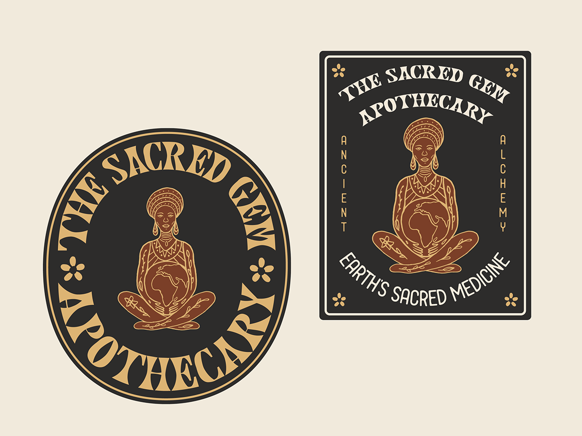
The brand design needed to be flexible and work well across various applications such as website, social media, printed collateral and product labels. To accomplish this we created various brand identifiers including a primary logo, secondary logos, mascot, icons and word marks.
To adequate represent their brand ideals we illustrated an African healer / Mother Gaia character, cradling the earth in her lap. The botanical illustrations on her body represent the earth’s sacred medicine.
We used a psychedelic typeface to convey the new age and alternate ideas of the brand and product range. We tied the design together with a vibrant, yet subtle colour palette to assure the customer the products are from the earth.
Our design choices were made to create a brand design that was instantly recognisable and memorable. We believe we have satisfied the brief and created an identity that represents the brands values and appeals to their ideal target audience.
To accommodate these usages we created a flexible and versatile identity including a primary logo, suite of secondary logos, word marks and brand icons.


